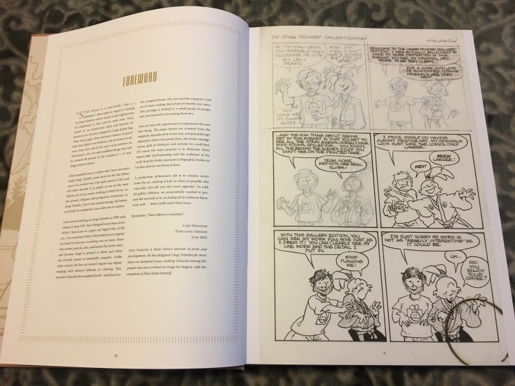
Ever since the announcement that Stan Sakai’s Usagi Yojimbo will change publishers from Dark Horse to IDW, I’ve been thinking a lot about Stan and Usagi. So it was a pleasure when a wonderful video by For the Love of Comics led me to revisit two of the books I am most proud of editing.
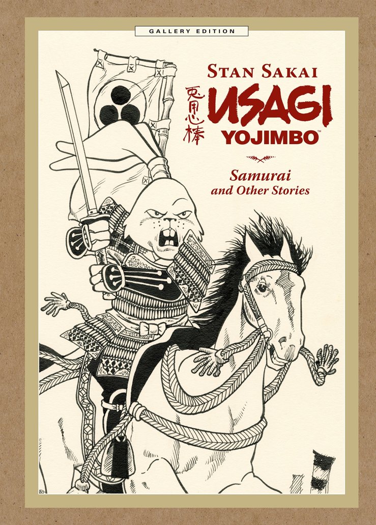
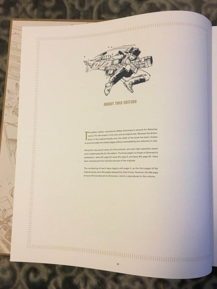
Usagi Yojimbo: Samurai and Other Stories Gallery Edition was the fifth Gallery Edition published by Dark Horse, and the second that I edited, after DH’s first one, RoboCop versus the Terminator Gallery Edition, showcasing the original artwork of the legendary Walter Simonson and, just as importantly, the groundbreaking lettering of the great John Workman. The format was DH’s answer to the Artist’s Edition format innovated by IDW (coincidentally Usagi’s new home), and when I campaigned to edit RoboCop versus the Terminator, the assignment came with the mandate of figuring out just what the Gallery Editions would be. I don’t recall if the line had a name at that point. Certainly we referred to RvtT in-house as an Artist’s Edition, but I don’t remember if it was officially called a Gallery Edition yet, or if that is something we came up with while assembling the book.
At the time, I couldn’t afford any of IDW’s Artist’s Editions, nor did I have room in my small apartment for them, but a couple fellow DH staffers brought some in for me to look through. That said, it’s not a difficult concept to grasp; much of the Artist’s Editions’ elegance is in their simplicity—the art is reproduced at full size and in high resolution, and extraneous design elements that might distract from the art are left out. That said, I had a few ideas for things I wanted to see in these books as a reader and that might visually distinguish them from IDW’s line.
Designer Tina Alessi and I looked to the world of high-end archival books to create a classy and unified appearance for the line. The first version I received looked great but, with its dark blue borders, I felt it was too staid, a bit reminiscent of law books. However, much of the rest of what became the look of the covers was already in place, and Tina’s suggestion of a woody, chipboard texture for the next draft perfectly captured the feeling of something important without being stuffy. It still felt like it deserved a white-glove treatment but had an organic element that brought it greater warmth. The second draft became essentially the finished version, and the minimalist interior design followed. Key to its success was the subtle use of color throughout to make the black line art stand out. All the design pages used a navy blue instead of black and some light brown design elements evoked the cover and unified everything. Dark Horse’s Curator’s Collection line, coproduced with Kitchen Sink, use a different design, but every Gallery Edition that has followed adapts Tina’s brilliant template.
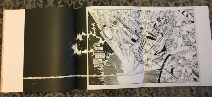
In terms of content, less is more, but I had a few tweaks I wanted to bring to the format, including a mission statement at the beginning of the book breaking down everything from how we selected the width of the book to what the penciled-in page numbers mean to why some pages had to be reproduced from xeroxes. Because Walter’s originals varied in size and spreads were drawn on a single sheet rather than two sheets taped together (a practice shared by Stan), it was important to me to reproduce these pages on tipped-in gatefolds rather than across two book pages with a seam in the middle. I don’t know for sure that no Artist’s Edition had done that before, but none that I examined while prepping RvtT had done so. One of the spreads couldn’t be located, so with a heavy heart we planned to include it from a xerox, but at what I remember being nearly the last minute, Walter found the original, and we were able to place it in the book.
Finally, because I was also editing a standard-edition hardcover of RvtT at the same time, one of the pleasures of the books was developing their two gallery sections in tandem, selecting which pieces felt more like extras for the comics edition and which original art pieces gave more insight into Walter’s process in drawing the series for the Gallery Edition. In my favorite bit of crossover, the inks for the new cover Walter drew for the comics reprint edition are included in the Gallery Edition at original size, while his pencils for the cover are included in the gallery of the comics edition.
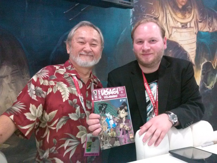
We were very pleased with how the RoboCop versus the Terminator Gallery Edition came out, and I had similarly enjoyed placing full-color scans (at reduced size) into a reprint of the Gene Colan–drawn Curse of Dracula, as well as including descriptions of the process of restoring Hal Foster’s Tarzan Sundays in a series of books even larger than the Gallery Editions (though still actually reduced slightly in size at DH president Mike Richardson’s request, so that they would match the size of other strip collections he admired). Because I had been working with Stan for about six years at that point, I was among the people who pestered him that an Usagi Gallery Edition was a natural addition to the line. Stan’s reticence described in the linked video and the book itself aren’t exaggerated: simultaneously proud of his clean artwork and humble about his achievements, Stan didn’t quite see where the interest in his original pages would come from. Ultimately I presented a plan for a book that charted Usagi’s—and Stan’s—evolution over the first decade of the series and promised there were others like me who would treasure the opportunity to pore over his originals. I knew what a special experience that was, as I’d been reading Usagi from the original art when it came in every month for years at that point.
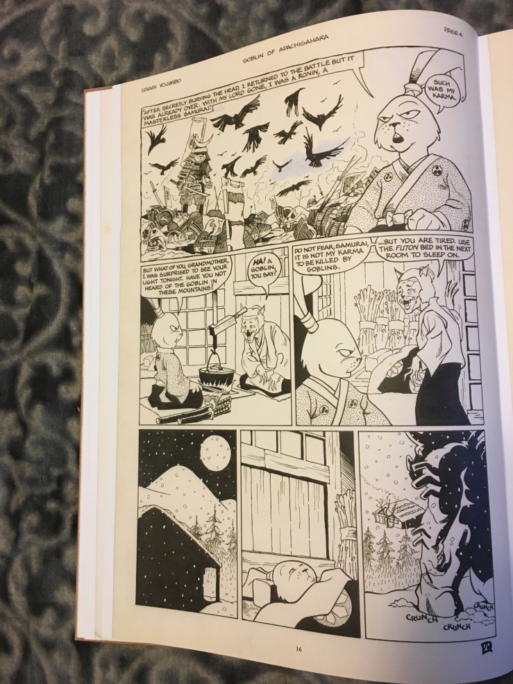
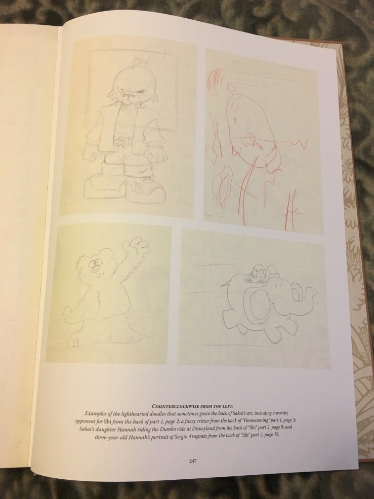
Initially, we had to beware of stepping on Fantagraphics Books’ toes too much, as my original pitch for the book was longer and pulled exclusively from the issues that Fantagraphics still had the graphic novel rights to. Over time, a few stories were dropped and two issues from the Mirage Usagi series were added, as I was in love with the way Stan depicted heavy rain with whiteout. The focus shifted to stories that included the introduction of many of the supporting characters, each of whom looked a little different in their original incarnations. The inclusion of Kitsune’s debut also allowed for another two-page spread to be presented as a tipped-in gatefold. And to really convey the idea of Stan’s pages as physical objects, I revealed my longtime obsession with the backs of Stan’s pages, which often include layouts, character sketches, notes to himself, and sometimes fully rendered cartoons drawn for fun.
With RoboCop versus the Terminator, Walter Simonson himself oversaw the scanning of his artwork and we received the files (with the exception of photocopied pencils, which came to the office in a stack for us to choose from), so all of the quality control and checking against the originals was done on Walter’s end. For Samurai, Stan FedExed the originals to Dark Horse, where designer and production artist Cary Grazzini (who has worked on Usagi longer than anyone except Stan) and I went through them page by page. Cary outdid himself with the scanning, taking incredible care to reveal every tiny bit of whiteout and faint pencil work. I compared proofs of every page to the art pages and noted places where a detail of the originals could be brought out more, and somehow Cary managed to bring them all to life. It’s the work of someone every bit as masterful in his field as Stan is in his.
I left Dark Horse in September 2015, and the book released about two months later, and so it was among the first DH books shipped to me at home rather than appearing on my desk at the office. When I decided to move on to new things after seven years at one publisher, no longer editing Stan was one of the hardest parts of that decision. I had been assisting Stan’s editor Diana Schutz on the main Usagi series for six years before editing it myself for a sadly brief time, though I had also launched the Usagi Yojimbo Saga line, overseen a digital presentation of Usagi’s early years (as Fantagraphics did not then have a digital program in place), and worked with Stan on a few other projects on my own before that. Getting this book in the mail was bittersweet, but taking a finished copy from the shrinkwrap brought back all the joy of those years. If I do say so myself, we captured what it felt like to open a new issue’s worth of pages from Stan each month pretty well.
The second, also-lovely Usagi Yojimbo Gallery Edition, The Artist, came out about a year later. I didn’t have any direct role in editing it, beyond proposing doing a second book while we worked on the first, with the ultimate dream of eventually publishing a Grasscutter Gallery Edition down the line. (IDW—call me! I got this.) However, I did edit the title story for Dark Horse Presents a while earlier (it is mistakenly credited to Diana in the Gallery Edition, but these things happen) and was thrilled to see both its color and black-and-white versions get the spotlight. After watching this video today, I picked up both volumes and got lost in them all over again, just another fan of one of the all-time great comics.

Great stuff. How was the name “Gallery Edition” chosen?
LikeLike
Thanks so much! I’m not entirely sure about the series title. The more I think about it, the more I feel like the name Gallery Edition might be the one thing that was figured out before I was assigned the book.
LikeLike
.. “restoring Hal Foster’s Tarzan Sundays in a series of books even larger than the Gallery Editions“ .. – that sounds tantalizing ! Would you care to talk some more about this ?!
LikeLike
I will have to refresh my memory some, but working on these was a good time and there are probably some good stories attached if I dig through my notes.
LikeLike